Interior Design Fall Color Trends 2011
Color in design is HUGE this year, which is par for the course when coming out of an economic climate as we’ve seen the past few years. A conservative climate is usually accompanied by conservative, darker colors and neutrals. When we are hopeful about the economy and are ready for a change, we see color creep back into both interiors and fashion. This past year, we’ve seen a departure from the calm, neutral creme palettes as evidenced by Honeysuckle, the Pantone Color of the Year.
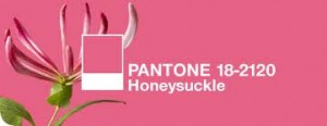
Pantone 2011 Color of the Year
Each year, Pantone selects which colors will be on trend and these are the colors you will see show up in clothing and home decor.

This year, Honeysuckle showed up paired with a lighter color, such as white or creme, and a darker color as you see on the wood on the chairs (House Beautiful)
It’s relatively easy to interpret these palettes into your own space. In the two home decor pictures above, Honeysuckle is paired with neutrals such as creme and brown. The brown fabric on the sofa functions as a second neutral in the space, in addition to the creme and beige on the walls. It’s interesting that David Bromstad paired Honeysuckle with a brown and a bright yellow. He is based in Miami and these colors are similar to what you see in a tropical area such as Miami, in food such as mangoes and Cuban spices, and in paint colors on the homes and buildings.
These are Pantone’s 2011 Colors
Just as you see them showing up in personal fashion products

Fashion with 2011 Pantone colors bamboo and phlox. Really, you could wear these anywhere. I love the satchel purse!
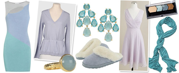
Fall fashion with 2011 Pantone colors quarry and orchid hush. These Kate Spade chandelier earrings would be fabulous with a black cocktail dress or a white Labor Day outfit
You will see them in home fashion as well
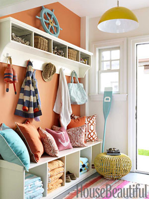
The big picture for interior design for Fall 2011 is going to be a mosaic of color and style. The designer or stylist of this entryway managed to incorporate almost every color of 2011.
No fear of color here either

An elegant living room using Pantone Phlox (purple) as its core color, also paired with neutrals (Elle Decor)
We will still see the same neutrals, such as brown, grey and creme, for awhile in our core pieces. The neutrals serve as a balance to these tones and we will just see them turned up a notch by the brighter tones.





0 comment